
IRIS powers essential work across accountancy, payroll, HR and education. This concept explores how the brand could evolve to feel more global, intelligent and connected, without losing the trust it’s built over decades.
Project
IRIS Concept Rebrand
Industry
B2B / SaaS
Created entirely by Ross Idzhar. Find out more about me here.


The logo
The refreshed IRIS identity keeps the essence of the original, with a cleaner, more contemporary wordmark in Google Sans Flex. The new symbol reworks the existing colours into an abstract iris, with four curved forms representing Accountancy, Payroll, HR and Education as one connected brand.


Evolving the brand
The aim was to retain the recognisable essence of IRIS, while giving it a more confident expression for its next chapter. The identity becomes cleaner and more refined, with a stronger focus on the organisations IRIS supports, putting its breadth, scale and customer impact at the heart of the brand.


A more human expression
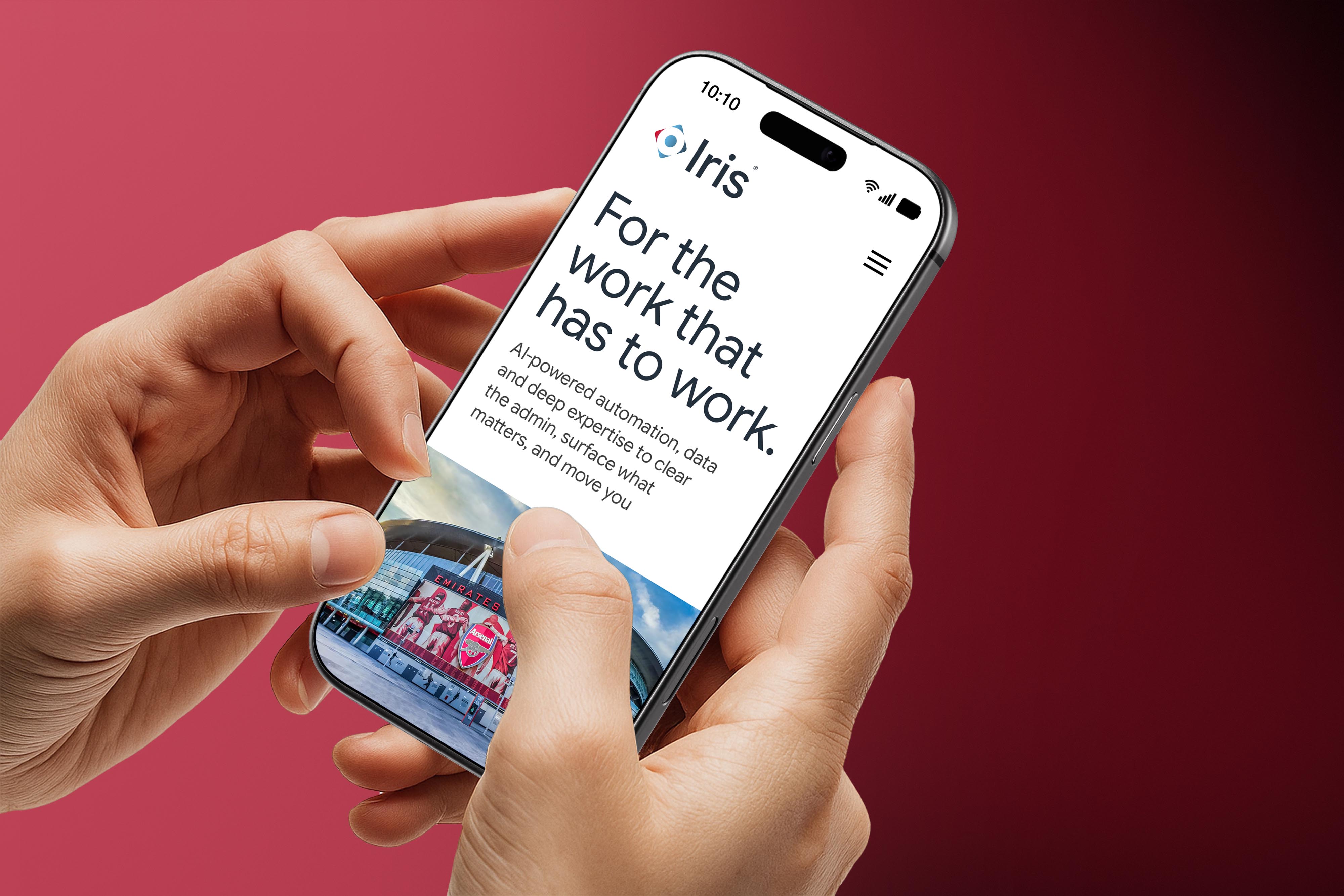
People become a much bigger part of the visual language. Natural, aspirational photography brings warmth and personality, while refined typography and a more considered use of the existing colour palette create a contemporary, premium feel. Gradients add depth and energy, giving the system a subtle sense of technology without becoming overly “tech”.



Built to scale
The result is a flexible system designed to work across campaigns, social, product, digital, events and internal communications. Distinctive enough to feel recognisably IRIS, but broad enough to represent a diverse global customer base.

